For years I have had a passion for all things Disney, the standard that they create in their marketing and products is out of this world, so I've had a dream of always working for the company one day, in pretty well any role, but I think I'd excel in a creative one.
I have applied for jobs over the years, but have always thought that my resume doesn't quite convey what I am truly capable of and that was how this project was born.
I had several ideas whenever I first thought of this many months ago, but one just kept sticking with me, the Haunted Mansion. The Haunted Mansion has always been a favorite of mine, the simplicity of the ride yet the effectiveness is second to none making it a fan favorite for myself and many others. I've loved the ride since I was younger and have even used some of it's gags in other things I've done (Pepper's Ghost, Leota, etc.)
So here it is...the way I decided to send a resume and cover letter, will it work? Only time will tell, but you can't go through life avoiding the risks!
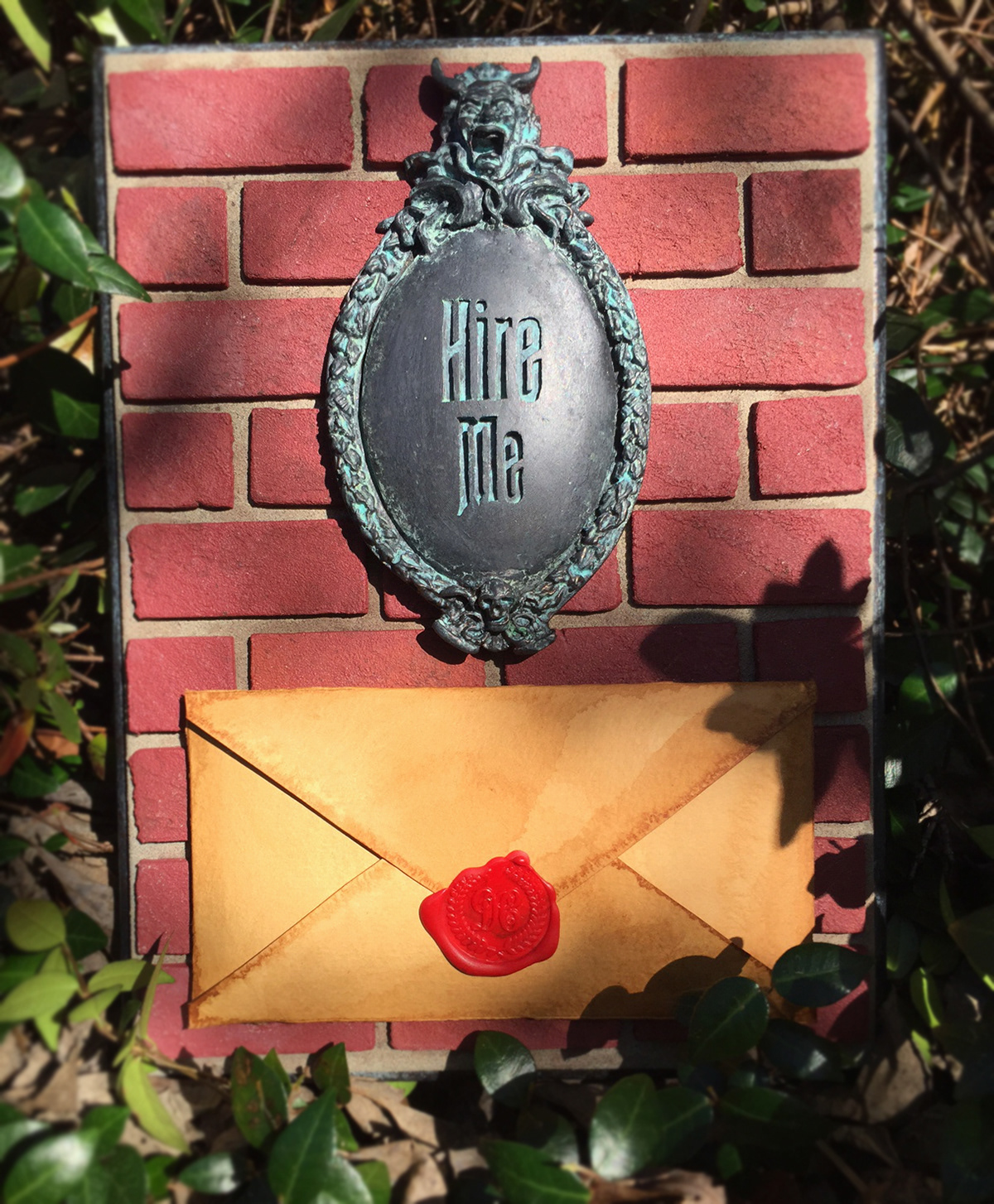
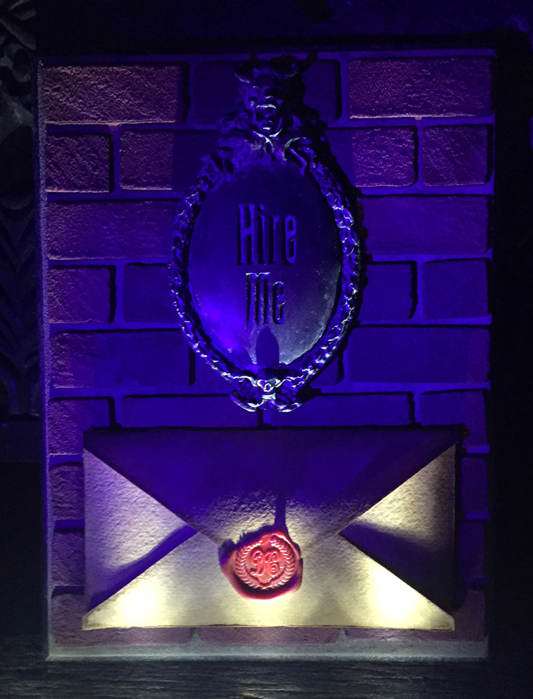
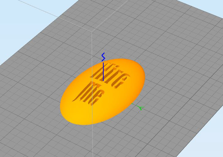
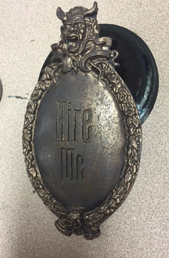
I had a small 7"x4" plaque version of the Haunted Mansion sign but I wanted it to say something different, obviously, so I designed a medallion for the center in Autodesk123D.
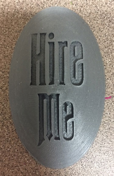
After the medallion was designed I went to 3d print with it, this is the smaller test version that I did before moving to full size.
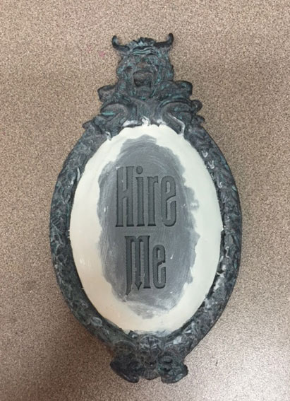
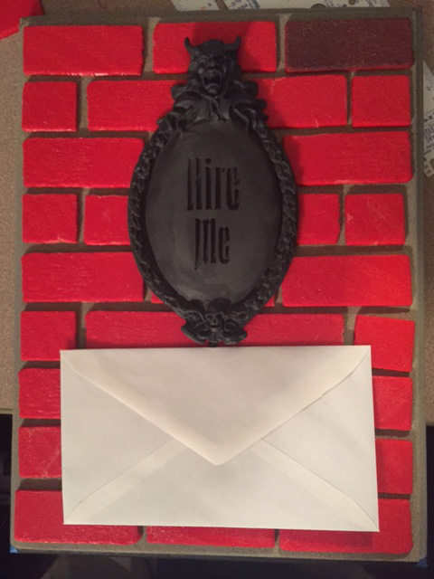
I then cut down the center portion of the plaque that I had and removed the 'Haunted Mansion' text, instead installing the medallion that I printed. The edges were then coated with putty to give it a smooth look again.
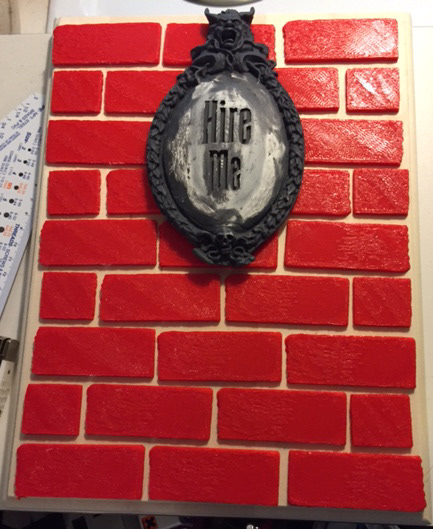
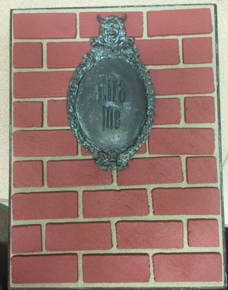
I had the vision well ahead of time to make this look like it was ripped right off the wall, like someone had taken the bricks and all with it, so I came up with 4 different brick designs with slightly different textures and sizes and printed out 31 to fit the plaque that I was using.
I also took to note the scale of the project, when you look at the sign from the park you can see there are 6 or 7 bricks behind it, while I only got about 5 1/2 I was still happy with the scaling.
The sign was given a dark base coat, I then put this all together to get a general idea of the layout, you can also see a brick color test in the top right. I went through several iterations of brick color and texture to get something I liked most.
Bronze paint laid on.
One of the challenges was to bring back the patina look that the sign originally had, several years ago I ran across a paint that uses an activator to create the bronze patina that I used for this project.
One of the challenges was to bring back the patina look that the sign originally had, several years ago I ran across a paint that uses an activator to create the bronze patina that I used for this project.
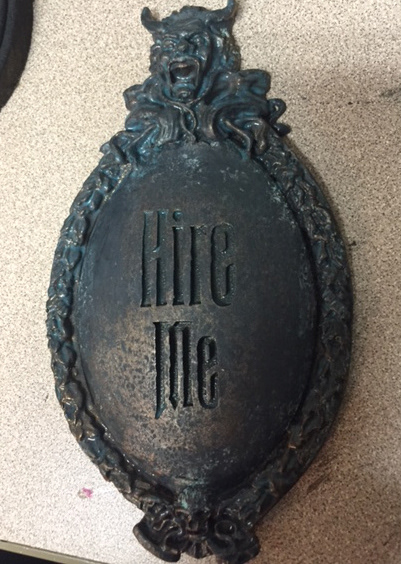
After the activator was sprayed you can see the change in the bronze, slowly becoming a green patina. It took several coats to get it where I wanted it to be.
This was another test fitting, here you can see the patina on the sign, also the bricks were given their base red coat.
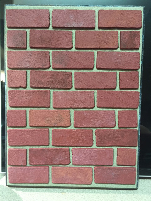
Bricks weathered and finishing work on them. I took several pictures while out at stores and restaurants of their bricks, one thing I noticed were the subtle color differences in the bricks which is something I emulated here.
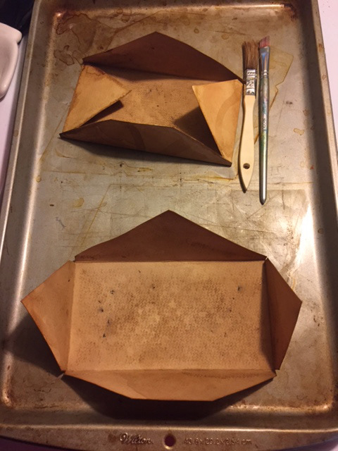
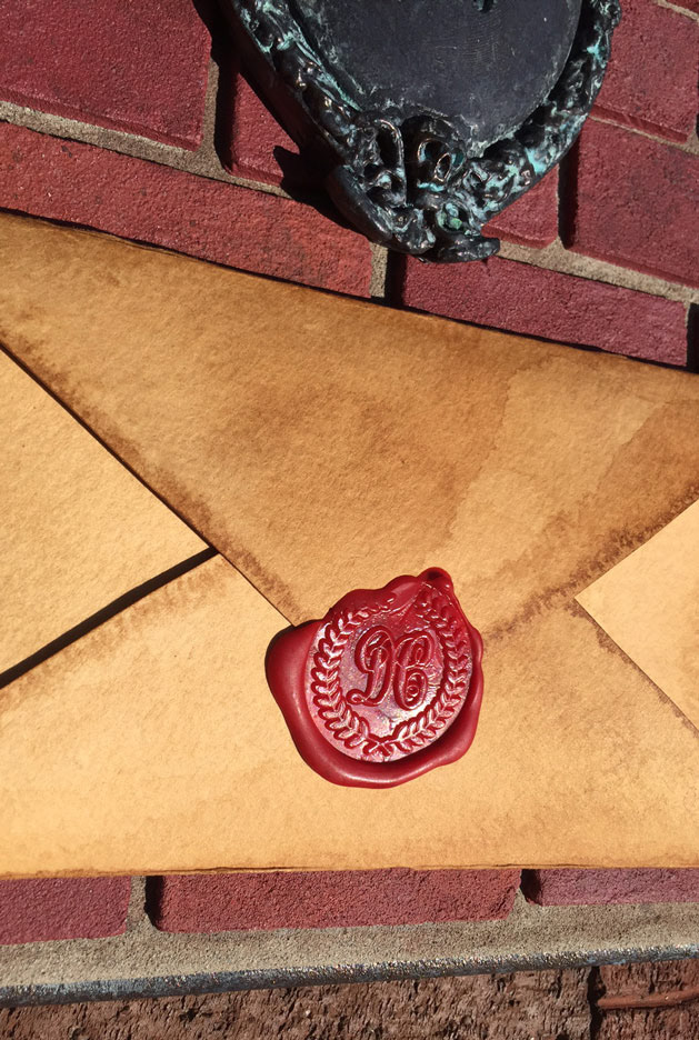
All along I knew I would be handmaking the envelope for the front, these are two of the envelopes I worked on, they were cut from watercolor paper and then stained with coffee and tea and an oven to give it an aged look.
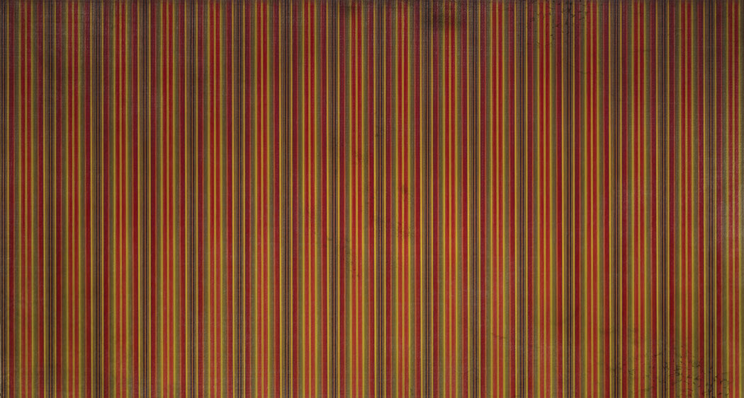
The wallpaper for inside of the envelope was created entirely in Adobe Photoshop with some reference images of the original wallpaper from the rooms. I also gave it a bit of grunge aging to make it seem more authentic.
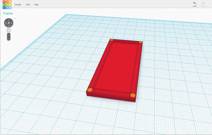
I went through several different ways to create the frames for the interior stretching portraits, eventually I decided to create a frame in tinkercad and 3d print those as well. I made some sacrifices on the overall accuracy due to the sizing of the frames.
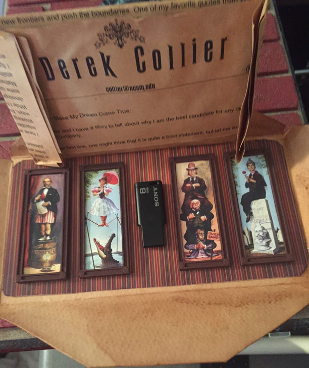
This is the interior of the envelope, including a snippet of what the letter looks like after printing and weathering. I LOVE the stretching portraits of Haunted Mansion, so I had to use them somewhere, I 3d printed the frames and tried to make them look as close to the ones used for the attraction. Here you can also see the printed wallpaper that I made and weathered a bit.